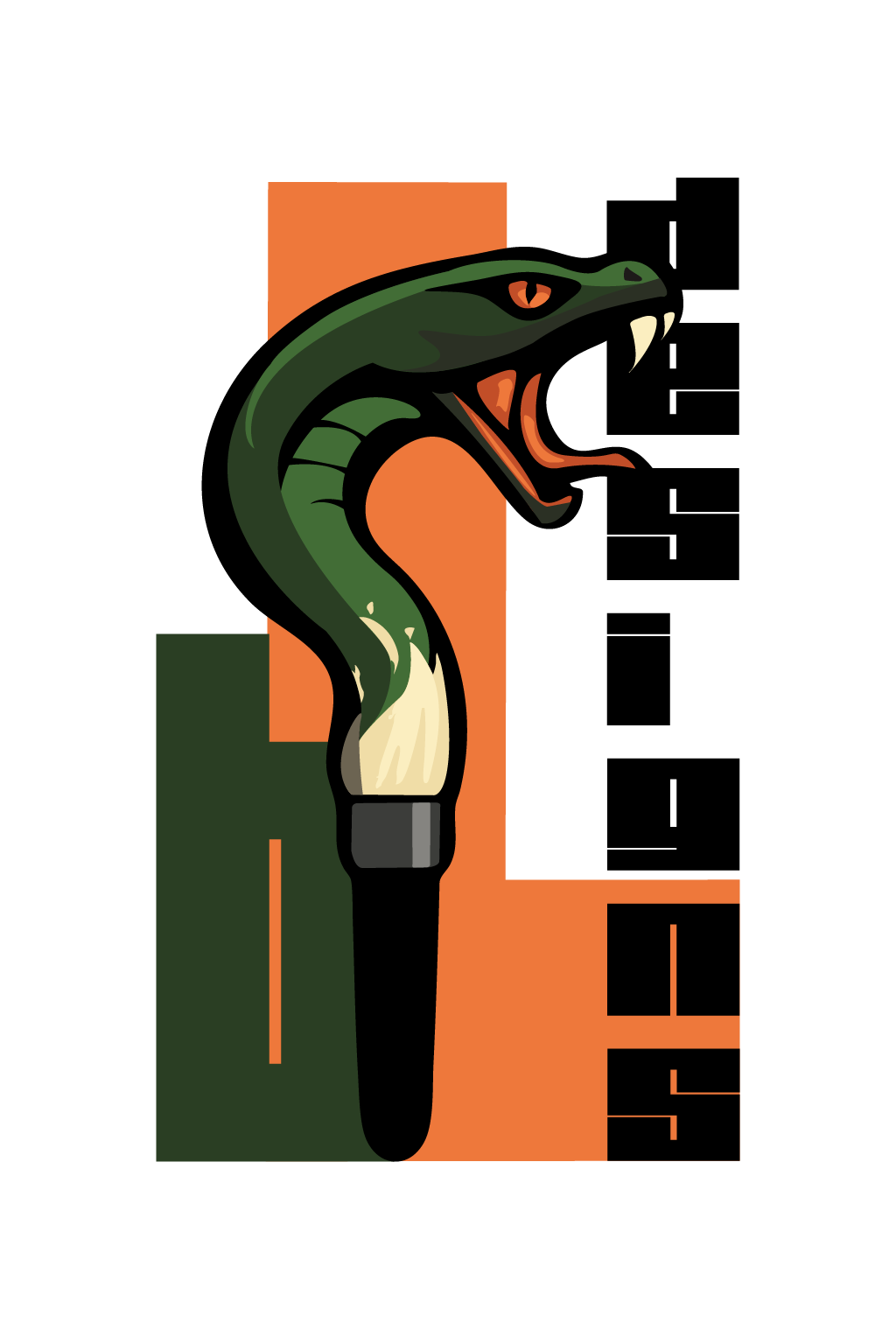


The Cobra Collective: Identity & Packaging Design
This project explores the fusion of aggressive branding and organic geometry. Moving away from traditional, static logos, this brand identity uses a "typographic wrap" to define its mascot. The King Cobra isn't just a graphic on the box; it is built entirely from the brand’s core identifiers, creating a seamless integration between the product's name and its visual soul.
The design utilizes kinetic typography to simulate the natural, coiled power of a strike. By distorting the letterforms to follow the hood's curvature, the packaging achieves a 3D effect that catches the eye from multiple angles. This "textural branding" serves two purposes: it creates a high-contrast, recognizable silhouette from a distance, while offering intricate, discoverable detail upon closer inspection.
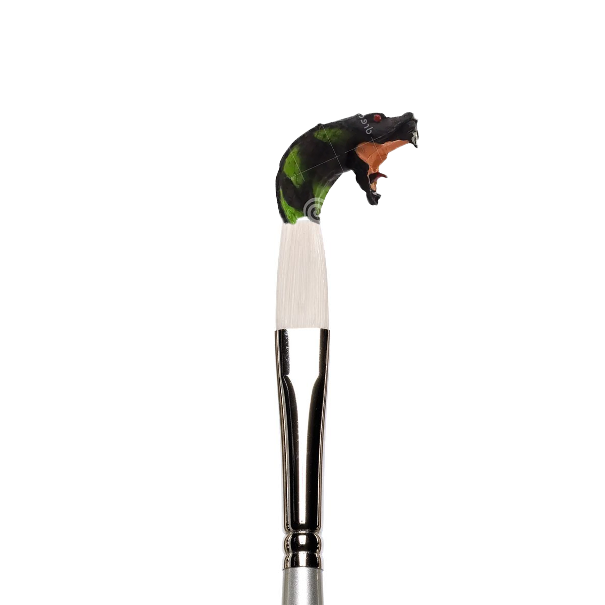
Although the first concept does not look that cool...